Happy New Year to all our regular readers!
We’re kicking off 2025 with a countdown of what we think were the 10 most interesting charts from our blogs in 2024.
As you’ll see, we covered a lot of different topics – from introductions to options and short selling to latency to making markets better for issuers and investors.
We start our countdown at number 10:
10. Our first interns’ guide to options
In 2024, we added to our suite of regular summer interns’ guides. In addition to introductions to market structure, how trading works and ETFs, we added a guide to options markets.
This included a lot of information, such as how option payoffs work, where the liquidity in U.S. options markets is, and when and how each option expires (Including a useful table showing what options expire in the open vs. the close, and which have physical delivery).
But my favorite chart from the blog looked at the “moneyness” of options being traded. As the chart shows, the majority of options being traded when they are “out of the money.” That significantly reduces the premium costs (as the likelihood of exercise is lower) and the amount of hedging a market maker would need to do (as the delta is lower). It also means that adding up “options notional value traded” provides a meaningless comparison to liquidity in underlying stocks as the exposures and hedging are both well below 1-to-1.
Chart 10: Most options are trade when they are out of the money
9. Short interest isn’t as scary as it seems
It’s fair to say that investors and companies both don’t like it when their stock prices fall. However, it’s usually wrong to focus blame on short sellers.
As we detailed in a blog in 2024, there is data available to help us understand some aspects of short selling.
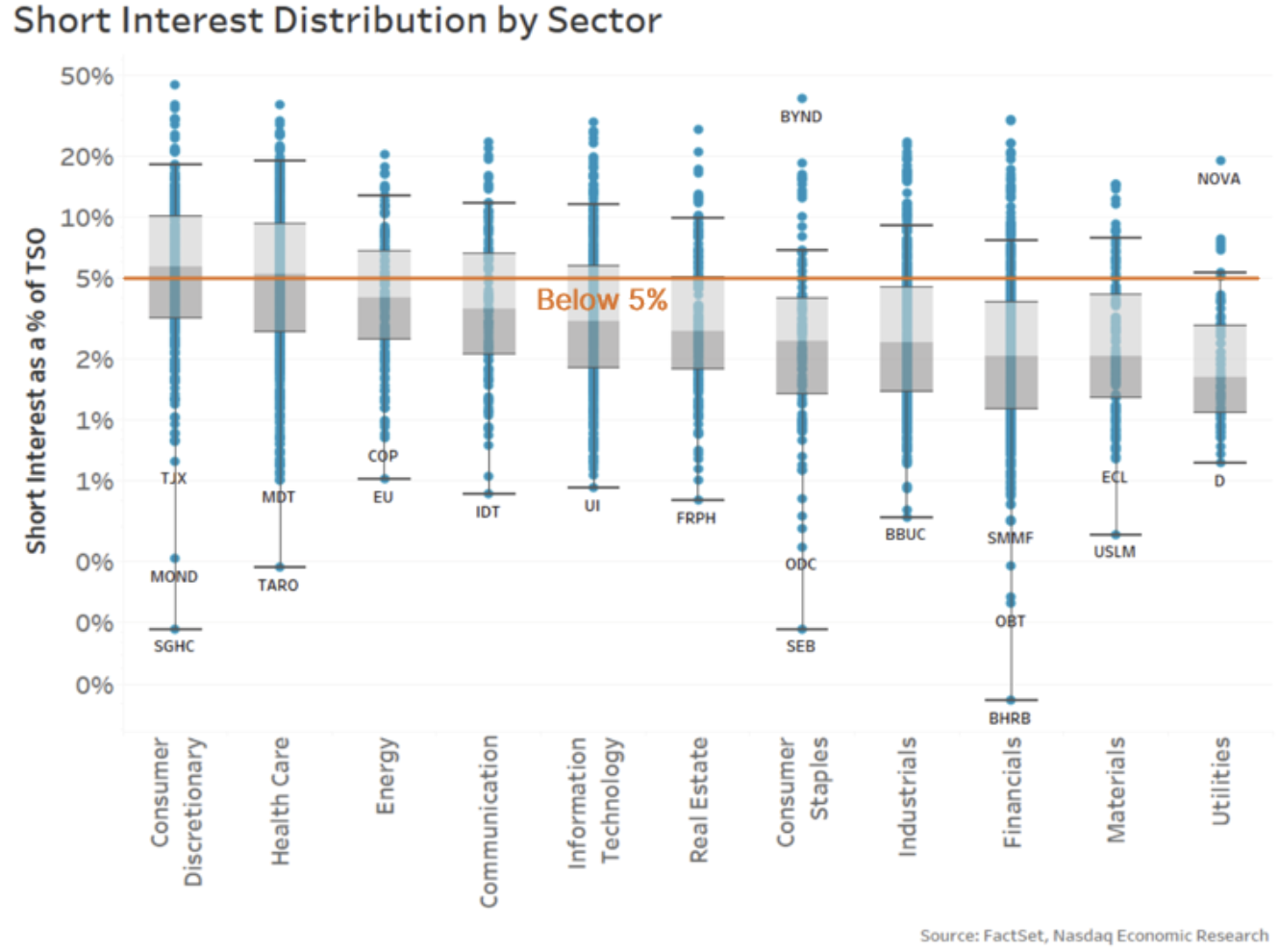
First, we saw that despite a very high proportion of trades having a “short sell” flag on them, the actual levels of short interest (or holdings) in the market tend to be much lower and stable. As the chart below shows, most stocks have 5% or less of their shares outstanding held short. That confirms that most short selling is done by “bona-fide market makers” who are required to sell and buy all day (to qualify as a market maker) and not adding to directional positions.
We also cited rules that require stock to be borrowed before settlement. That’s so buyers can receive the stock they bought from a “short” seller – as without that, the trade would “fail.” And data shows that failing trades are relatively rare, and most fails are for exceptionally small (most likely retail) trades.
Chart 9: Most stocks have below 5% of their shares outstanding shorted
It’s also important to note that research consistently shows that short selling makes markets more efficient. It allows for hedging and cross-market arbitrage to occur, which helps keep Futures and ETF prices correct and stock spreads tight.
8. What defines a small-cap stock depends on the index provider
People frequently talk about large-, mid- and small-cap stocks – as if it is clear what companies are included in each group.
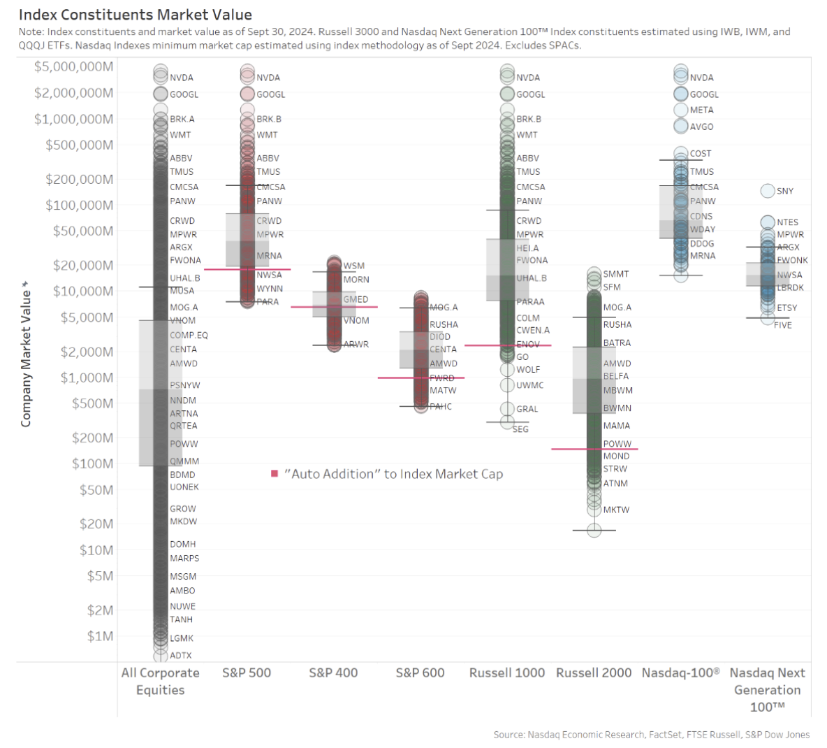
However, our favorite chart from that study shows that it can depend a lot on which index provider you are using. In fact, the chart below shows that some small-cap stocks are larger than the smallest large-cap stocks. Although to be fair, that’s a result of price changes during the year as well as a conscious decision to reduce index turnover and trading cost for anyone running an index fund.
Chart 8: Stocks included in different market cap indexes by index provider
7. Looking at index trades to estimate index tracking
Index funds and ETFs are getting more and more popular.
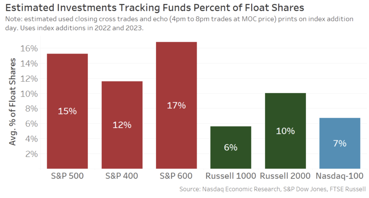
In another study, we looked at how much of a company’s available shares trade in the close on an index addition date.
The results were revealing, showing that the market can provide a huge amount of liquidity instantly as the market closes in order to satisfy indexer demand. That’s even more impressive given recent research shows the cost of that liquidity has been falling even as index funds continued to grow.
Chart 7: The MOC is able to absorb huge amounts of liquidity on index rebalance dates
6. Is the U.S. really the most liquid market in the world?
People frequently boast about how the U.S. is the cheapest, most liquid equity market to trade in the world.
However, with roughly 6,000 companies listed in the U.S. versus less than 900 companies listed in France, is it even fair to compare trading in Apple to Total?
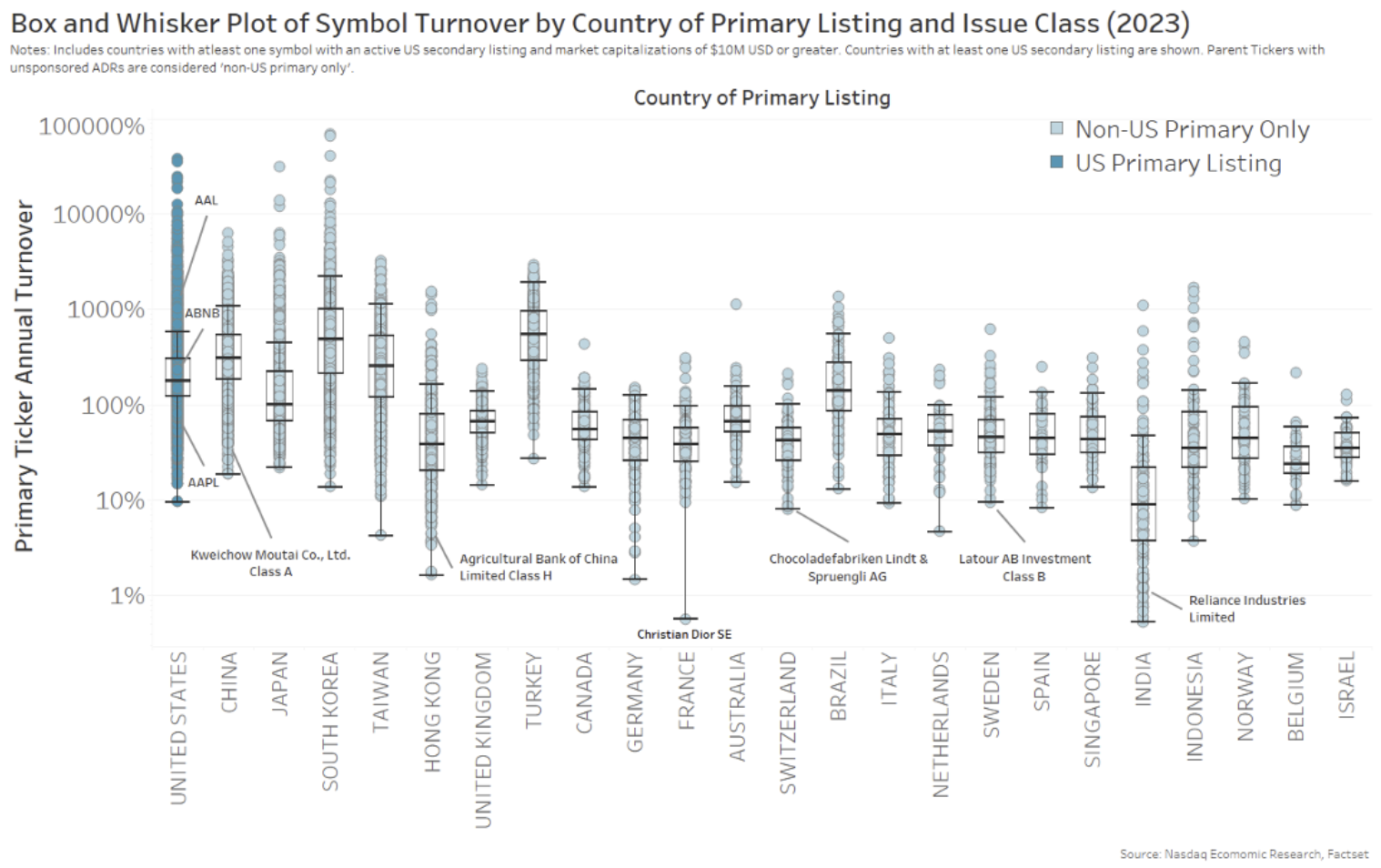
It’s fairer if we compute the “market-cap turnover” of each company, which is measured as the times the total available shares trade each year. That accounts for different share prices and market caps around the world.
The result (as we show in the chart below) was revealing. U.S. liquidity was good, but not the greatest. Notably, liquidity in a number of Asian countries – with generally strong retail markets – was, on average, even better. Although, as another chart in that study showed, Asia’s larger developed markets dragged the average for the whole region down below that of the U.S.
Chart 6: Annual market-cap turnover for each stock (by country)
5. Exchanges fees work very differently to ATS’s
The U.S. Securities and Exchange Commission (SEC) was extremely busy in 2024, finalizing a multitude of new rules. A few targeted exchanges and their fee structures, including reducing access fees and eliminating volume discounts for lcustomers who trade and quote a lot.
These rules only affected how exchange fees work, which was ironic, given that 2024 was also the year that off-exchange trading passed the 50% mark (more than once). That’s especially important as it’s a level considered a tipping point critical to market quality and having an NBBO that is meaningful to the market and actually protects investors.
In short, by focusing on exchange fees, the SEC missed the increasingly competitive economics of the “other half” of the market.
We have said before that equal is not fair. That’s something that seems undeniably clear when you look at rates charged for the SIP (which include volume discounts) and how the SEC recoups its annual budget (which varies over time).
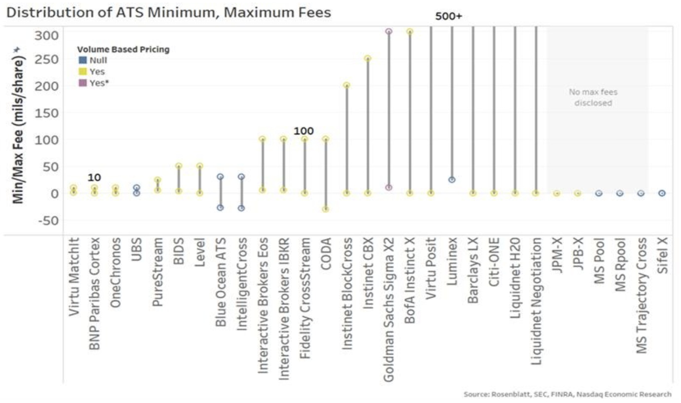
The economics of the “other half” of the market is very different. Rather than being fair access and equal (like the SEC wants for exchanges), it is bilateral and bundled, with customer quality tiers and segmentation that adds to spread capture (allowing fees to be higher). In fact, as the chart below from this blog highlighted, ATSs charge a wide range of fees – from “free” to much higher than the current exchange fee cap.
Either way, “ten” is clearly not the norm, nor could it be said that other fees in the marketplace are “equal”.
Chart 5: Form ATS-N shows just how complicated market pricing is across (even off-exchange) venues
4. One millisecond is only de minimis to a human
Years ago, the SEC created a new “de minimis” rule designed solely to approve IEX’s speed bump market (the same year they denied Cboe their own speed bump proposal, which was only fractionally slower). The SEC has since leaned on that rule to approve IEX’s D-limit (fade-able but protected) lit quotes. Ironically, the U.S. regulator declined to use it for determining an acceptable level of latency for the SIP.
All of that history is relevant to a study of trading latency we did in 2024.
What we discussed in that blog was how, even at the speed of light, it takes time for a trade to travel around the U.S. marketplace for fills, which happen in real-time, fractions of a second apart, causing reverberations across the market.
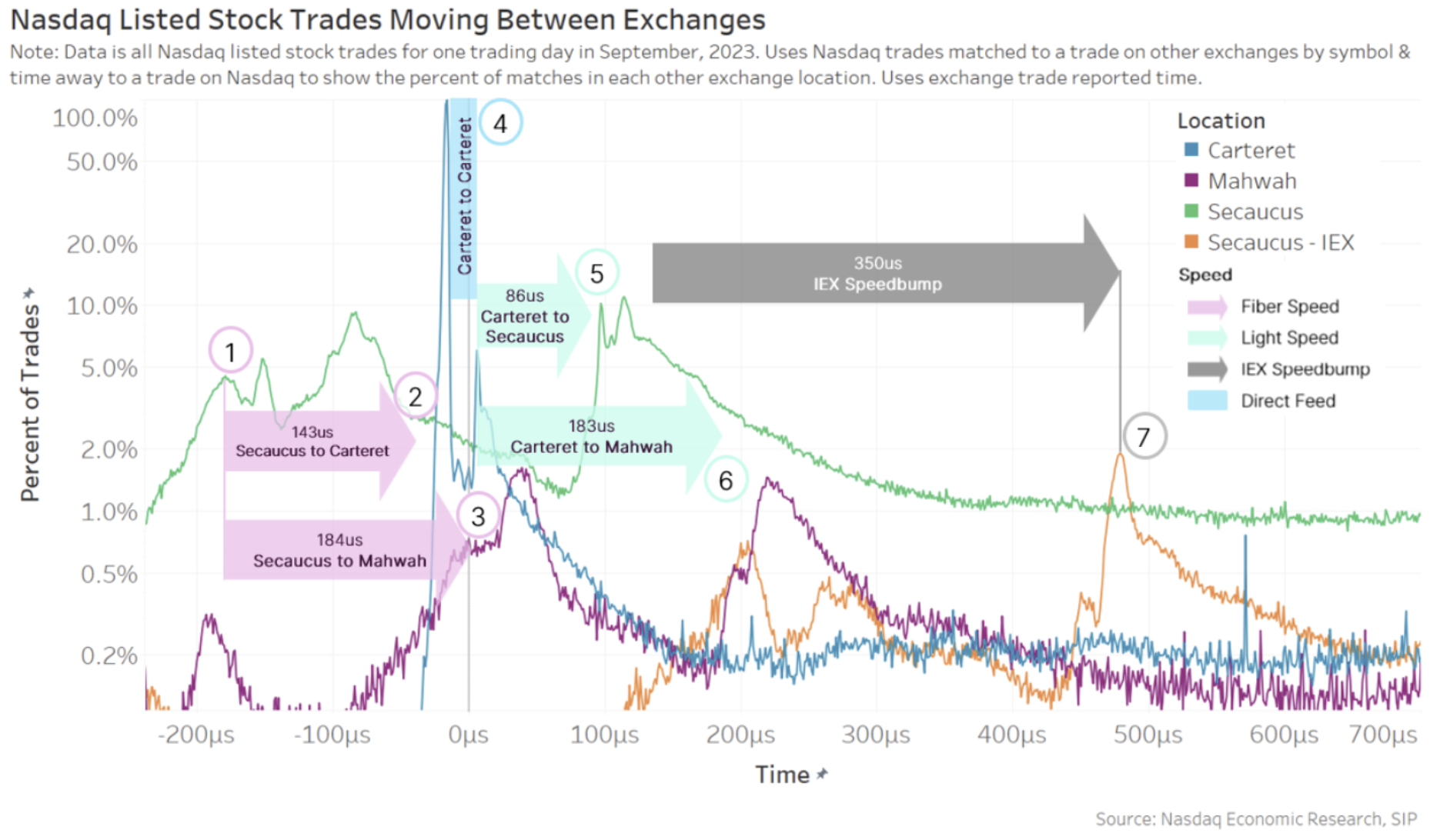
In fact, what our favorite chart from that blog showed, using microsecond timestamps (one-thousandth of a millisecond) is that we can see a lot of trades in the U.S. market initiate from Secaucus, where most broker algorithms are located. Initially, the orders from those algorithms travel at fiber speed around the U.S. market (pink arrows), then, as fills are seen at each venue, a reaction seems to occur at microwave speeds (green arrows) before finally passing through the IEX speed bump and trading there last, if any of their quotes have not, by then, been repriced.
Even with the IEX speed bump delaying trades occurring on their venue, from start to finish, this all happens in less than 1 millisecond.
Chart 4: Trades travel around the U.S. market and cause reactions that last less than one millisecond
3. Latency arbitrage detected in London dark pools
What we talk about in Chart 4 above is what leads people to talk about latency arbitrage. A new academic study showed how this can work in practice in dark pools in the United Kingdom.
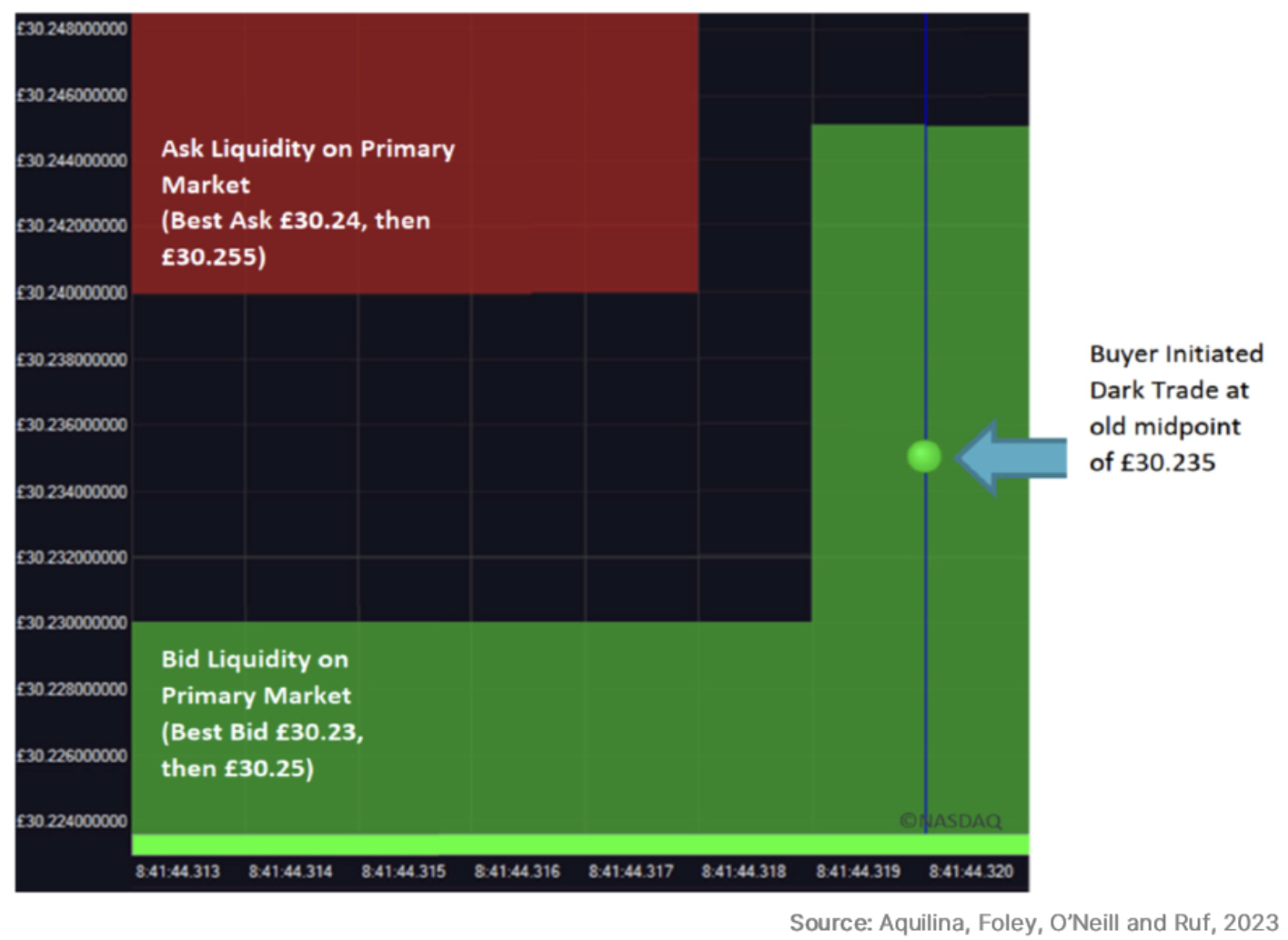
Dark pools, by design, peg orders to the quotes set by exchanges. The chart from that blog that most clearly showed what they found is below. It shows:
- The bid on exchange increasing (green color).
- Before a fill occurs in a dark pool at the “old midpoint.”
This is possible because “fast” arbitrageurs can send a trade on microwave, while quotes travel on optic fiber (which has a slower speed of light but is more reliable).
The study found that “a substantial amount of stale trading occurs [in dark pools].” They also found that arbitrageurs were on the winning side of the trade more than 96% of the time – buying at the stale midpoint while selling at the primary markets at a newer, higher price.
Chart 3: Dark fills occurring at old midpoints thanks to distance-created latency
It has since been replicated across Europe, with research from Euronext, SIX Swiss and Deutsche Börse finding similar results.
This study has important implications for the consolidated tape debates occurring in Europe and elsewhere.
As we’ve said before, all prices are delayed, and a consolidated tape will always be (even) slower. That’s why even our competitors say a consolidated tape should never be used for trading.
Said another way, a consolidated tape can never be pre-trade (it’s just physics). However, it could be used to quantify how much trading is occurring at these stale quotes.
This has market structure implications, too. The fragmentation reduces the fill probability to dark pool customers (even if a buyer crossed the lit market spread) but also makes spread capture harder on the primary market harder (as spread crossers are mostly more aggressive trades). The result is worse economics for price setters and ultimately wider spreads and less depth.
2. Depth and spreads react to basic economics of supply and demand
Tick sizes have been studied in depth by us and academics. The findings are all pretty consistent, showing that the economics of spreads and depth are driven by simple supply and demand.
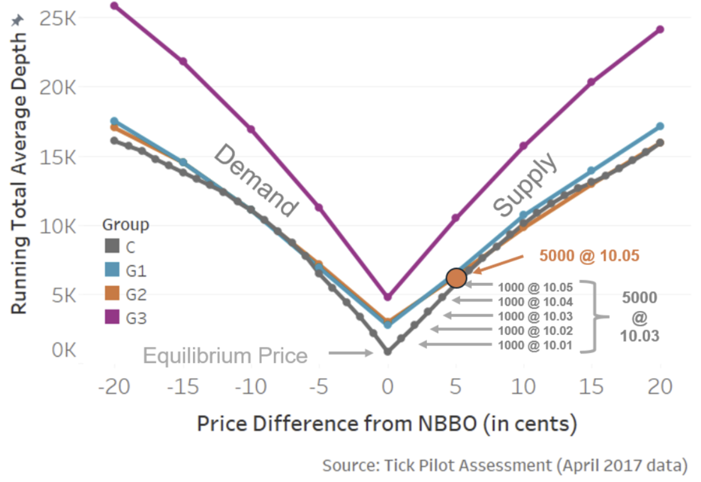
In the blog where we summarized these findings, the most relevant chart is the one below. It shows that:
- Supply and demand curves for stocks tend to be quite linear.
- Reducing the tick (for tick-constrained stocks) helps to reduce not only the spread but also the depth. For investors, spreads and depth are a trade-off.
Based on all the studies, the only result that was able to improve both spreads and depth of the NBBO was the trade-at group in the Tick Pilot study (shown as G3 below). Interestingly, that’s what happens when the price setter gets to capture their own spread – rather than BBO being used to trade elsewhere like we see in chart 3 above.
Chart 2: Research shows improving spreads almost always worsens depth; it’s a trade-off without trade-at
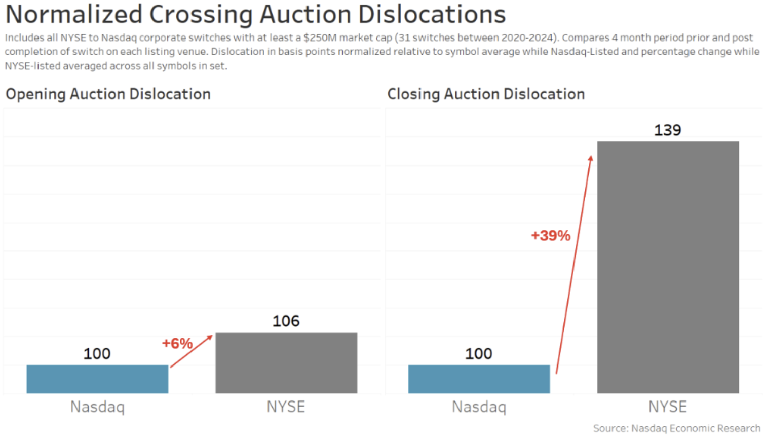
1. Nasdaq has better auctions for issuers
During 2024, we saw the 500th company switch from NYSE to Nasdaq.
Obviously, we all trade in an NMS world (National Market System) with UTP (unlisted trading privileges) meaning stocks can trade anywhere – regardless of where they are listed.
But when we look at the data, we see that Nasdaq market quality is still better for companies.
Our favorite chart from that blog looked at the open and closing auctions. It shows that different auction rules can reduce a stock’s volatility. That’s important because research suggests that it can reduce a company’s cost of capital, which should lead to additional investments and returns for investors. This, in turn, is good for the U.S. economy.
Chart 1: Switches have lower auction volatility on Nasdaq
We hope everyone had a happy and healthy holiday season. We’re looking forward to bringing more new and interesting insights throughout 2025. 
Source link
 Insights Daily World is your one-stop destination for discovering unbeatable discounts, trending deals, and the latest offers across various products. Stay informed with the newest updates, breaking news, and insightful deals, all designed to help you save and stay ahead


